

Plum and Copper Are Replacing Burgundy: The Runway Data Behind Fall 2026’s Moodier Color Shift
Last autumn, burgundy was the default answer to "what do I wear for fall." New runway data suggests that reign is ending. Tagwalk, the Paris-based trend analytics platform, found that plum and copper each rose 309% on the autumn/winter 2026 catwalks — the steepest
Last autumn, burgundy was the default answer to “what do I wear for fall.” New runway data suggests that reign is ending. Tagwalk, the Paris-based trend analytics platform, found that plum and copper each rose 309% on the autumn/winter 2026 catwalks — the steepest jumps of the season and a clear sign that the palette is moving away from one dominant wine tone and toward a warmer, moodier family of colors.
The signal comes from Tagwalk’s analysis of the latest A/W 2026 fashion weeks, published in mid-August and reported by Paris Select Book. The platform tracks how colors, fabrics and silhouettes evolve across collections, and this season its ranking points in one coherent direction: designers are reaching for saturated, food-and-earth-toned shades — plum, copper, rust, tomato red, forest green — rather than the washed-out neutrals and pale pastels that defined the previous two years.
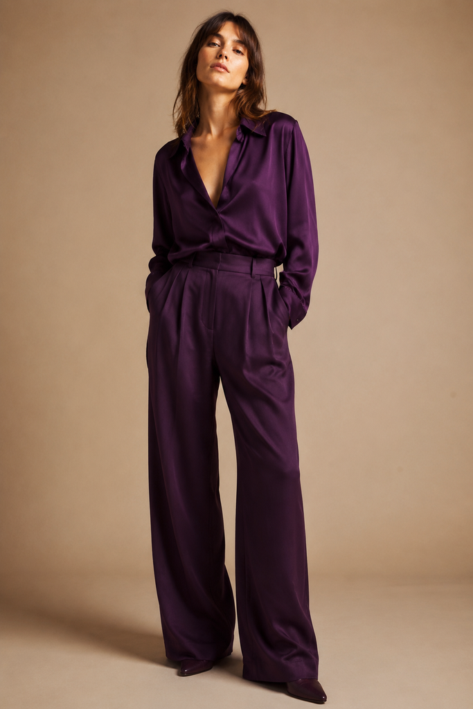
Plum is the season’s defining color. Tagwalk places it at Alaïa, Hermès and Zimmermann, where it sits somewhere between burgundy and violet. That positioning matters: plum keeps the depth and formality that made burgundy so wearable, but its purple undertone reads as fresher and slightly more directional. In practice it is a shade built for the workday — as a tailored blazer, a knit, a leather skirt or a pair of tights — because it feels polished without tipping into costume.
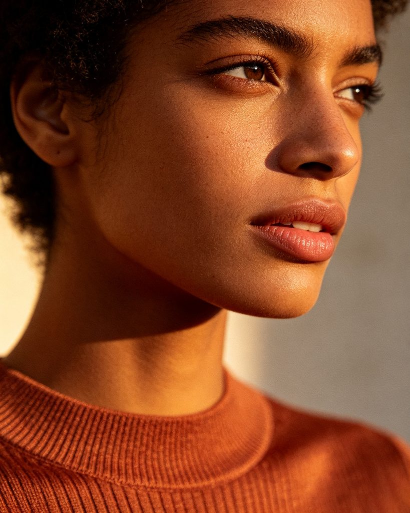
Copper, the season’s other 309% gain, works differently. Where plum is cool and composed, copper is warm and tactile. Chanel wove it into tweed, and Saint Laurent and Sézane worked it into ready-to-wear. It is the easiest of the season’s deep tones to style with neutrals and an everyday, low-effort look, and it reads well on warm and olive undertones in a way the cooler plum does not. The two shades are really one story told twice: a move toward colors with substance, the kind that hold up through November rain and office air conditioning.
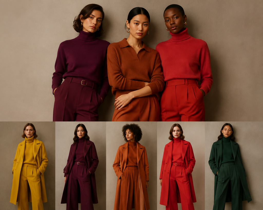
The rest of Tagwalk’s top five fills in the picture. Tomato red is still climbing — up 23% at Dior and Bottega Veneta — while canary yellow (+19%, at Loewe and Tory Burch) and forest green (+13%, at Tom Ford, Balenciaga and Lanvin) round out a palette that is deep, warm and slightly theatrical. Texture follows the color: Le Figaro’s rentrée round-up points to velvet, fitted tailoring and capes as the materials and silhouettes that carry these tones, alongside a broader return of strong-shouldered, structured jackets. Deep color plus structure has become the season’s shorthand for “dressed, not overwrought.”
For international readers the practical question is how to adopt this without replacing a wardrobe. These are forgiving colors. Copper and rust read well on warm and olive skin tones; plum and forest green hold their own on cool undertones; and all of them work on deeper skin. Deep tones also cross climates better than pale pastels — they layer under coats in a Northern European or New York autumn, and still look deliberate on a warm Southern European evening. Because they are versatile and do not show wear as quickly as light colors, they tend to justify their cost per wear, which matters in a season when shoppers are still watching budgets.
What to watch next: fashion month will test whether the palette holds. London, Milan and Paris show their spring/summer 2027 collections from mid-September, and the first sign of whether plum and copper are a single-season mood or a longer arc will appear on those runways — and in how quickly high-street retailers copy the shades. If the deep tones keep appearing, expect them reframed for spring as lighter plums and rusts.
The takeaway is simple. This is not just a color swap; it is a response to trend fatigue. After years of safe neutrals and soft pastels, designers and shoppers are moving toward colors that feel substantial — shades you can actually wear into November, not just admire on a mood board.