


Seafoam, Dots and the Summer Reset: Why 2026 Style Wants Lightness Without Looking Plain
Summer style in 2026 is moving away from the idea that ease has to look neutral. The most interesting shift is not simply that seafoam green, aqua, icy blue, chartreuse and polka dots are visible again. It is that these colors and prints are
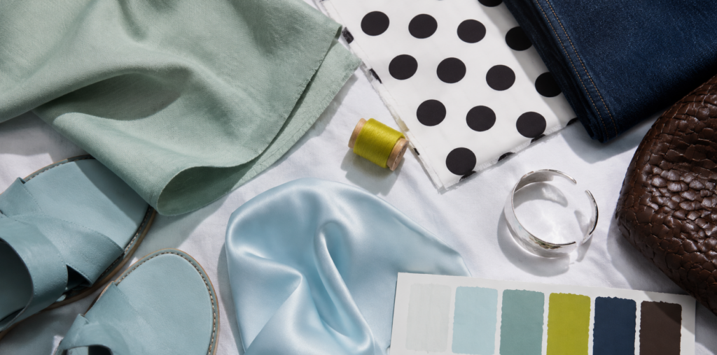
Summer style in 2026 is moving away from the idea that ease has to look neutral. The most interesting shift is not simply that seafoam green, aqua, icy blue, chartreuse and polka dots are visible again. It is that these colors and prints are being used to solve a familiar wardrobe problem: how to look fresh in real heat without buying clothes that feel like one-weekend novelties.
For several seasons, fashion gave shoppers a persuasive language of restraint: quiet luxury, soft tailoring, cream layers, black accessories, brown leather, grey knits. That language is not disappearing. But by summer 2026, it is no longer enough on its own. Vogue’s Spring/Summer 2026 trend coverage points to personality-driven dressing rooted in wearability, while its womenswear predictions identify icy tones, dusty pastels, spots and checks as key directions. The message is clear: after the long discipline of neutrals, people want color and pattern that can re-enter daily life without making the whole wardrobe feel chaotic.
The mint-adjacent green palette is useful because it sits between freshness and softness. Unlike neon green, seafoam, pale green and blue-green tones do not demand a full statement look. Unlike beige, they do not disappear. A pale green cotton shirt, aqua bag, seafoam slip skirt or blue-green sandal can cool down black, sharpen white, soften brown and make denim feel more intentional. This is why the color family matters in summer: it carries the psychological effect of shade, water and air, even when the garment itself is simple.
That does not mean pale green works the same way on every person. On cooler undertones, blue-leaning seafoam and aqua can look crisp near the face. On warmer undertones, a slightly yellower pistachio or light chartreuse may feel more alive. On deeper skin tones, pale green can be beautiful when the fabric has density, sheen or contrast rather than looking washed out. On very fair skin, a stronger aqua accessory or a pale green piece broken up with navy, chocolate, black or tomato red may be easier than a full pastel dress. The smarter question is not “is this green flattering?” but “which temperature, depth and texture makes this color useful for this body and wardrobe?”
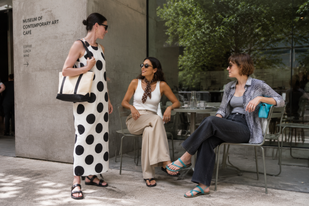
Polka dots are doing a parallel job. They bring movement and wit to summer dressing without requiring a complicated silhouette. Vogue reported in April 2026 that polka dots felt especially pronounced on the spring runways, appearing across modern shifts, bubble hems, second-skin dresses and poplin shapes. The print’s advantage is its readability. A dot is graphic enough to register online and in the street, but familiar enough to work in offices, holidays, weddings, school runs and city weekends.
The risk is nostalgia. Polka dots can easily slide into costume sweetness if they are treated only as retro femininity. The 2026 version feels more modern when proportion and styling interrupt the memory. A large dot on a clean column dress feels different from a tiny dot on a ruffled tea dress. A spotted scarf with a tank and trousers feels different from a full vintage-inspired look. A black-and-white dot can become almost architectural with flat sandals and a structured tote, while brown-and-cream dots can feel softer with linen, raffia or suede. The print becomes current when it is edited, not when it is copied from the past.
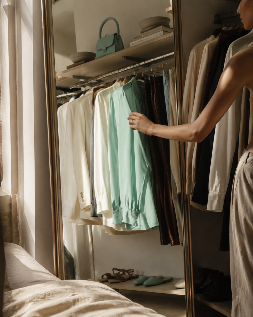
The broader color story also shows a change in shopping behavior. Pantone’s Spring/Summer 2026 colour planner describes a season built from balanced ranges and stronger statement shades, while recent fashion coverage has tracked aqua, turquoise, pale blue, chartreuse and other clear brights across summer wardrobes. These shades are not replacing neutrals; they are changing how neutrals function. A white tank and black skirt become more deliberate with an aqua sandal. A grey trouser looks less corporate with a seafoam shirt. A beige dress gains energy with a dotted scarf or blue-green bag.
This matters because many shoppers are still value-conscious. A color or print trend has to prove that it can do more than photograph well once. The practical test is cost per wear. Seafoam and pale green work best when they can connect to colors already in the closet: white, navy, denim, chocolate, black, silver, cream, tomato red or soft yellow. Polka dots work best when the base item has a stable shape: a slip dress, straight skirt, square-neck top, scarf, flat shoe or shirt. The more reliable the garment, the more expressive the surface can be.
Climate changes the answer too. In humid Singapore, Miami or the Mediterranean, the best version may be a seafoam linen shirt, cotton poplin dress or dotted scarf that can be removed when the day gets hotter. In London, Copenhagen or Toronto, a pale green cardigan or dotted blouse may work through cooler mornings and rainy afternoons. In Australian summer, the color story may need sun-safe hats, loose cotton and washable fabrics rather than delicate dry-clean-only pieces. Summer trends become useful only when they respect the conditions they are asking people to dress for.
There are three practical directions for readers. First, use seafoam or mint-leaning green as a cooling accent if your wardrobe is built around black, white, denim or brown. Second, use polka dots as a controlled print rather than a full aesthetic: one dotted dress, scarf, skirt or shoe can carry the idea. Third, treat the strongest 2026 colors – aqua, chartreuse, icy blue, tomato red and pale green – as punctuation. They do not need to dominate the outfit to change its mood.
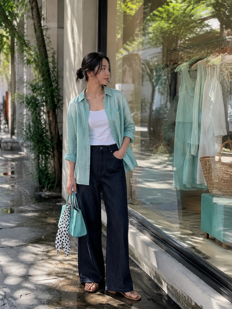
The most shareable takeaway is this: in summer 2026, lightness is not the same as plainness. A good summer wardrobe should breathe, move and survive heat, but it should also give the wearer a small sense of pleasure. Seafoam greens, aqua tones and polka dots are useful because they offer that pleasure at a manageable scale. They can refresh the clothes people already own instead of demanding a total seasonal reinvention.
The best version of the trend is not a pale green dress bought only because the color is trending, or a polka-dot piece worn only because the print is everywhere. It is the garment that makes an existing wardrobe feel more awake. Summer fashion does not need to choose between practicality and charm. In 2026, the strongest color and print choices are the ones that make everyday dressing feel lighter without making it disposable.