A Tale of Two Color Palettes|Pantone’s Minimalist Manifesto vs. Copenhagen’s Berry Tones
The color narrative for Fall/Winter 2026/27 quietly diverges into two distinct yet equally compelling paths: on one side, Pantone’s quietly introspective “Minimalist Manifesto”; on the other, the intense, warm “Berry Chorus” seen on the snowy streets of Copenhagen. In New York, muted clay and creamy
The color narrative for Fall/Winter 2026/27 quietly diverges into two distinct yet equally compelling paths: on one side, Pantone’s quietly introspective “Minimalist Manifesto”; on the other, the intense, warm “Berry Chorus” seen on the snowy streets of Copenhagen.
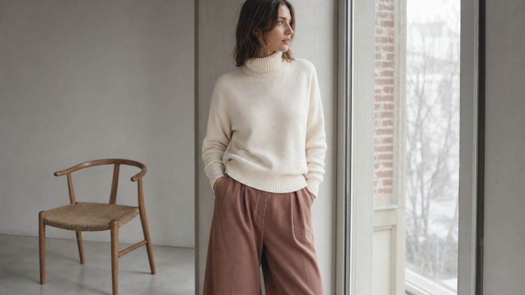
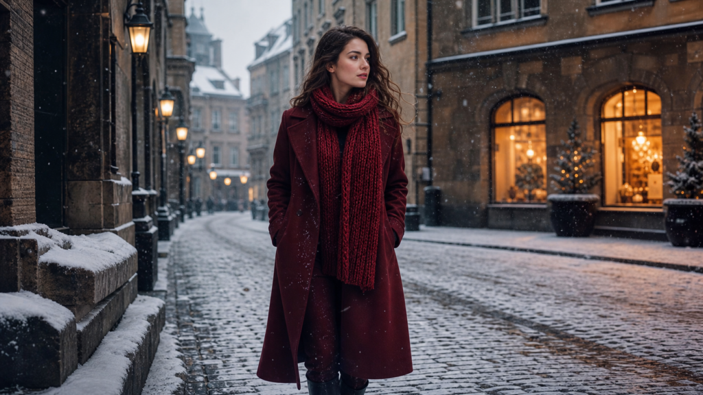
In New York, muted clay and creamy off‑white weave a sanctuary of “quiet luxury.” In Northern Europe, burgundy and deep cherry red glow like mulled wine, radiating a passionate, full‑bodied vitality against the winter chill. This is not an either‑or choice, but a chromatic revolution that can be as bold or as restrained as you wish. Whether you’re a professional seeking texture in your daily wear or a fashion enthusiast who loves to mix and match color, you’ll find your own fall‑winter palette here.
Part 1|Pantone’s Minimalist Manifesto: The Return of Quiet Luxury
Where the Trend Comes From
Soon after the Fall/Winter 2026/27 New York Fashion Week ended, the Pantone Color Institute released its annual trend report. The clearest signal this season: the frenzy of maximalism is receding.
Leatrice Eiseman, Executive Director of the Pantone Color Institute, explained: “Balancing minimalism with urban vitality, this season combines a sense of security with allure, creating a new color equilibrium. Consumers are looking for truly versatile, wearable colors, while also craving colors that inject energy, surprise, and spontaneity – a color duality seen through a fresh lens.”
In other words, today’s color preferences reveal a clever “duality”: people want colors that are truly versatile and durable, yet they also long for emotional value and surprise from color. That is why this season’s Pantone palette includes both reassuring earth tones and neutrals as well as vibrant, high‑saturation accent colors.
Decoding the Palette: Every Color Has a Story
The Pantone Fashion Color Trend Report for Fall/Winter 2026/27 New York Fashion Week features 10 standout trend colors and 5 classic seasonless shades.
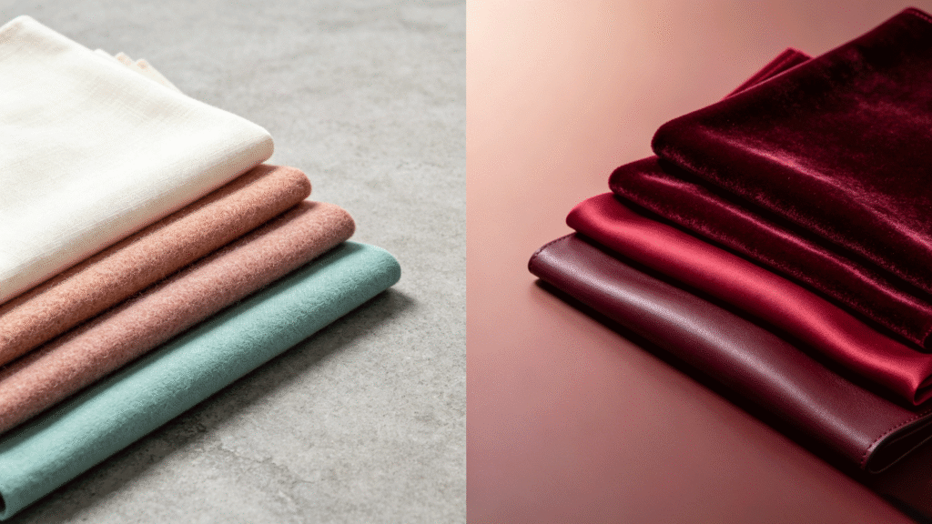
Egret (11-0103 TCX) – A warm, low‑saturation off‑white, extending Pantone’s 2026 Color of the Year, Cloud Dancer. It’s not a cold pure white but a warm milky shade with a hint of grey – like the soft light of early morning mist. As a seasonless neutral, it is versatile and warm, a “universal base” for the fall‑winter wardrobe.
Muted Clay (16-1330 TCX) – A low‑saturation terracotta tone. It’s not loud or glaring, but calm, solid, and timeless. Its warm reddish‑earth undertone brings a rustic, reliable natural energy to the season.
Neptune Green (14-6017 TCX) – A retro, refreshing ocean water green. Its appearance is not accidental. Eiseman calls it “one of the season’s biggest surprises,” injecting a lively, modern freshness into the heavy fall‑winter wardrobe.
Acacia (13-0640 TCX) – A high‑energy yellow‑green with a hint of green. It is seen as the most “surprising” accent in the F/W 2026/27 palette, breaking away from the season’s somber framework with a sense of spontaneous adventure and energy.
Festival Fuchsia (19-2434 TCX) – A festive, bright magenta, leading the pack of high‑saturation accent colors. It symbolizes freedom, vitality, and joy, daring to bring an unmissable visual impact to the fall‑winter wardrobe.
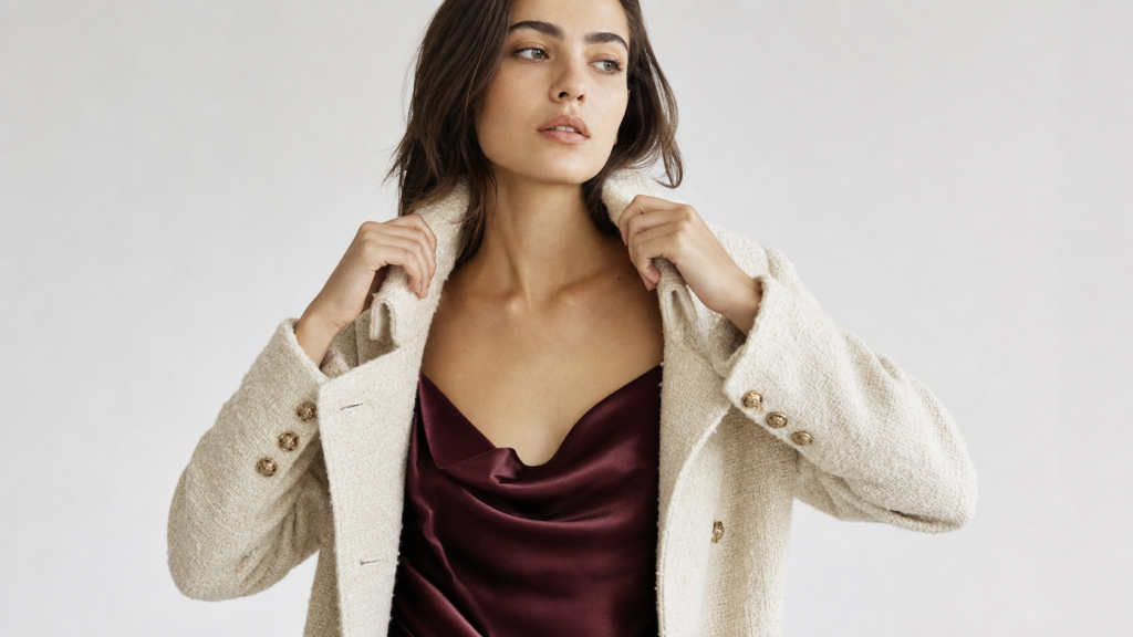
Red Mahogany (19-1521 TCX) – An exceptionally luxurious, rich reddish‑brown. When it appears on a coat or handbag, its deep layered quality instantly gives an outfit a calm, captivating charm.
Other notable colors in the report include Arabian Spice, Foxglove, All Aboard, Burnt Olive, as well as seasonal neutrals such as Candied Ginger, Toffee, and Underworld.
Styling Tips
The street style stars of Copenhagen offer a few foolproof ways to wear berry tones:
- Power look: berry long coat + all‑black base. Choose a rich wine‑red long coat and wear it over a black turtleneck and black straight‑leg pants. This is the most classic, least error‑prone combination – the black base provides a sophisticated foundation, while the coat’s warm heaviness balances the overall look.
- Tonal layering: berry knit + same‑color skirt. Pair a deep berry cashmere sweater with a slightly lighter silk skirt in the same color family. The contrast of textures (soft cashmere vs. sleek silk) and slight tonal variation creates visual depth. If the outfit feels too intense, add a small amount of neutral (cream or black) to breathe.
- Beginner approach: small berry accents. For those new to berry tones, start small. A berry‑colored cashmere scarf, a wine‑red beret, or deep cherry leather loafers can pop against a neutral base, preserving elegance while injecting just the right amount of warm emotion.